The visual design of the site is inspired by the Arts & Crafts movement, which not only has a glorious neo-Gothic aesthetic but also a humanism which is as relevant today as it was when rebelling against 19th century mass production techniques.
The background is a popular wallpaper motif by William Morris: the Willow Bough.
The title font is Sorts Mill Goudy, based on the work of Frederic Goudy, and the body font is Source Serif, more loosely based on the work of Pierre-Simon Fournier. Source Serif captures some of the naturalism I had in mind, though my ideal would be an open source version of Plantin, which I am sad does not exist.
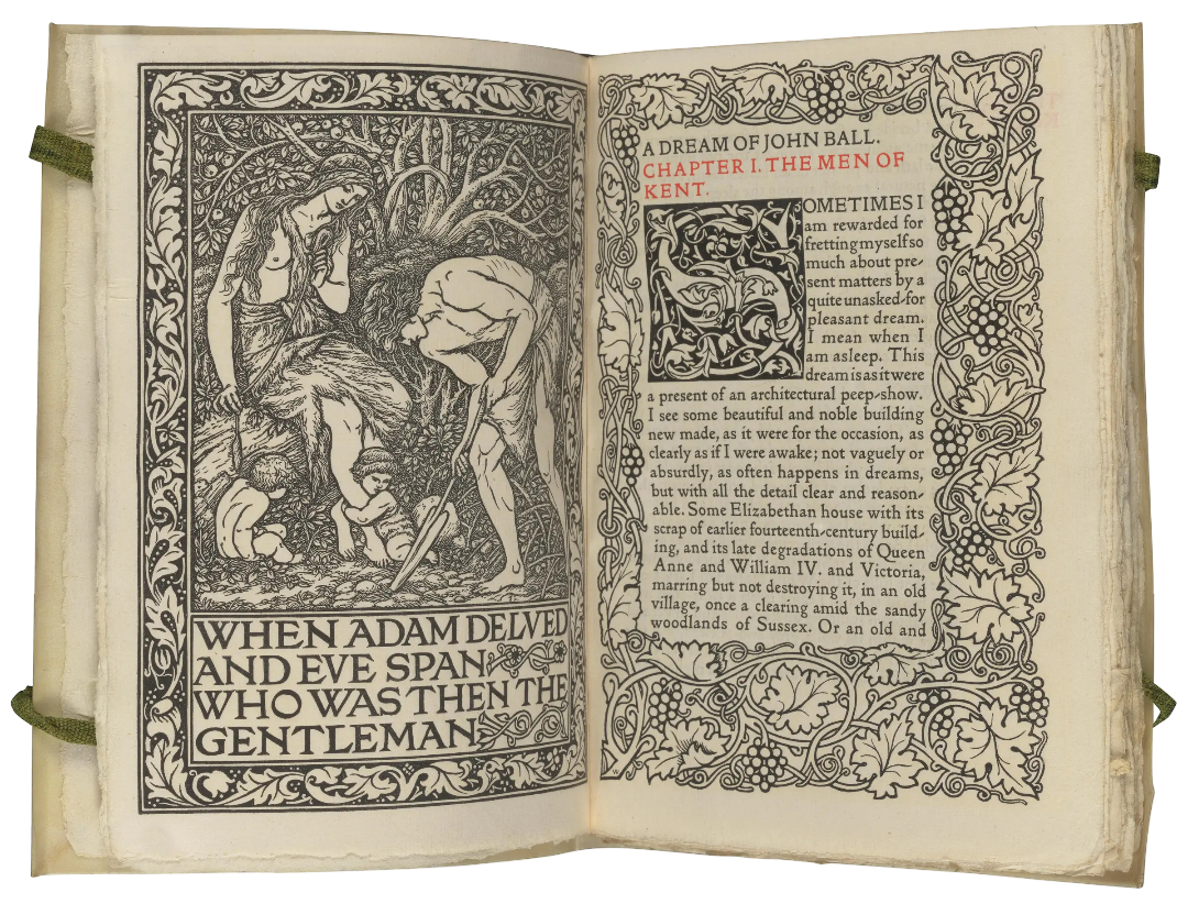
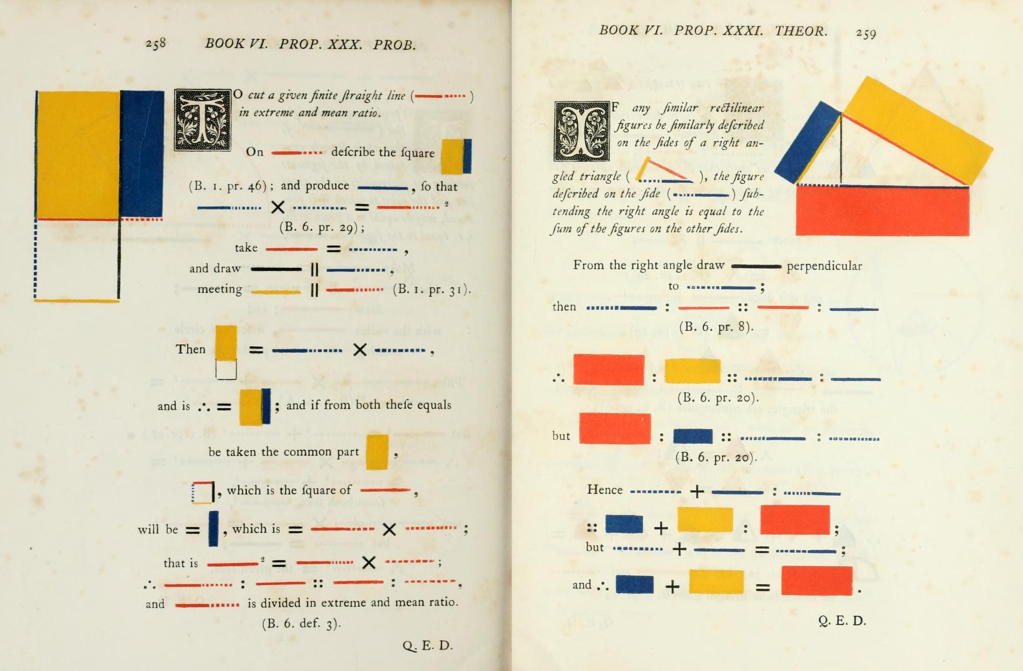
The initials used in the diary entries and some reviews are ultimately based on engravings found in 16th century printings of the Roman de la Rose. These served as models for an 1847 edition of Euclid’s Elements, which was beautifully digitised with a font for the initials by Nicholas Rougeux.
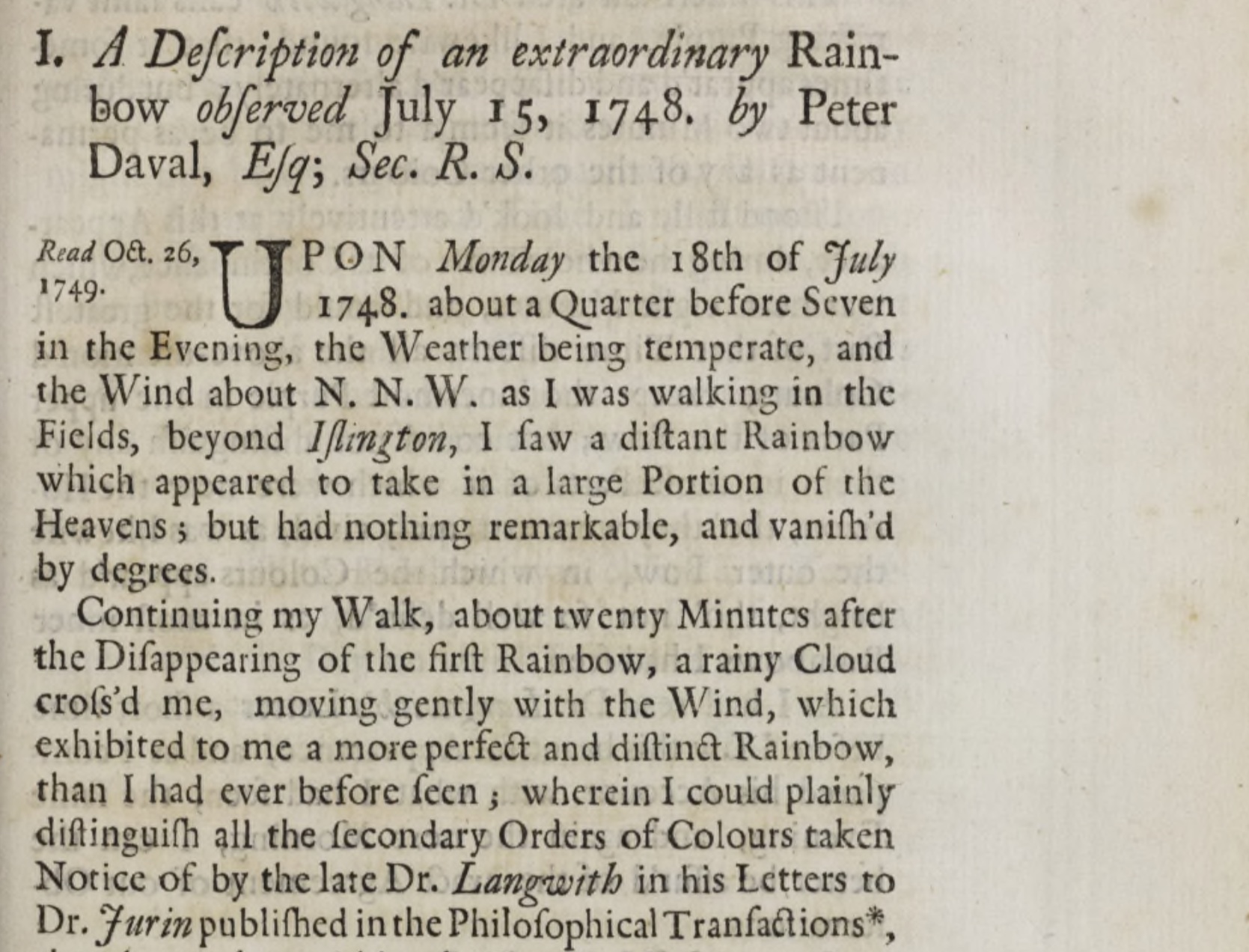
There is also some deliberate artifice in the writing style of the diary entries, inspired by 18th century papers published by the Royal Society of London in their Philosophical Transactions.