30th June 2025
An account of various Colour Systems, some long abandoned, interspersed with remarks on problems of Perception and Language
Previous observations on the language of botany introduced me to the word ‘glaucous’: generally defined as a dull or pale grey-blue or grey-green, the word is not usually seen outside of biology, where it describes all manner of flowers, fruits and vegetables (think especially of the glistening appearance of wine grapes or unwashed red cabbage), as well as animals like the glaucous macaw and the glaucous gull (for its grey wings). In the act of writing this, I also realise that my living room is glaucous, for I painted it a soft green which was impressionistically called feathers of a dove.
‘Glaucous’ is particularly common in ornithology, in fact, as in 1886 Robert Ridgway published A Nomenclature of Colors for Naturalists, in which he promoted the use of the word for the precise description of birds. By the time of his 1912 Color Standards and Color Nomenclature, which had much larger ambitions to standardise all colour terminology, he rather hysterically laid claim to having named 1,115 distinct colours, 20 of them glaucous shades. This is how he stated the motivation for his work:
The terminology of Science, the Arts, and various Industries has been a most important factor in the development of their present high efficiency. Measurements, weights, mathematical and chemical formulae, and terms which clearly designate practically every variation of form and structure, have long been standardized; but the nomenclature of colors remains vague and, for practical purposes, meaningless, thereby seriously impeding progress in almost every branch of industry and research.
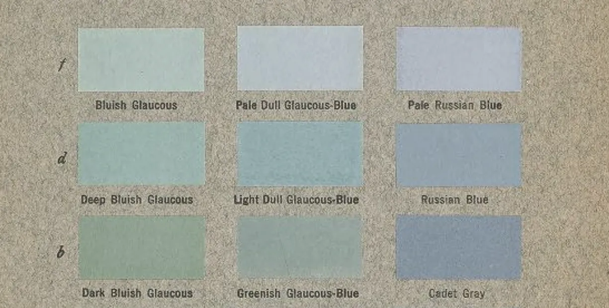
Looking at his samples and considering them in the context of their use in biological description, it seems to me that ‘glaucous’ really conveys texture as much as colour (and perhaps other dimensions of appearance besides) — is it genuinely possible to appreciate the glaucous purple of a grape without also imagining the waxiness of its skin between your thumb and forefinger? Or perhaps it has something to do with the way the colour catches the light in motion, the word ‘glaucous’ coming from a Greek word (glaukos) that Homer used to describe the gleaming sea (apparently without a specific colour connotation):
[Achilles] you are merciless. Surely
Peleus was not thy father, nor the queen
Thetis thy mother; rather, the gleaming sea
and jagged rock faces brought you forth,
so savage is your heart.
Ridgway’s project was doomed to failure because his approach made little practical sense: decontextualised colours are hard to map onto real objects whose appearances change with changes in physical conditions, and neither science nor industry stood to benefit from rote memorisation of a thousand atomised shades. This was already noticed by Albert Henry Munsell when he published his own A Color Notation a few years earlier in 1905:
The incongruous and bizarre nature of our present color names must appear to any thoughtful person. Baby blue, peacock blue, Nile green, apple green, lemon yellow, straw yellow, rose pink, heliotrope, royal purple, Magenta, Solferino, plum, and automobile are popular terms, conveying different ideas to different persons and utterly failing to define colors. The terms used for a single hue, such as pea green, sea green, olive green, grass green, sage green, evergreen, invisible green, are not to be trusted in ordering a piece of cloth. They invite mistakes and disappointment.
Thus Munsell devised a different colour system that’s still in use today, which can be found everywhere from RGB colour pickers on computers to the science of colour perception, and it was so successful because it’s a geometry: rather than specifying colours by name, they are specified by quantities of certain attributes (typically hue, chroma and value, or variations on these, such as hue, saturation and lightness).
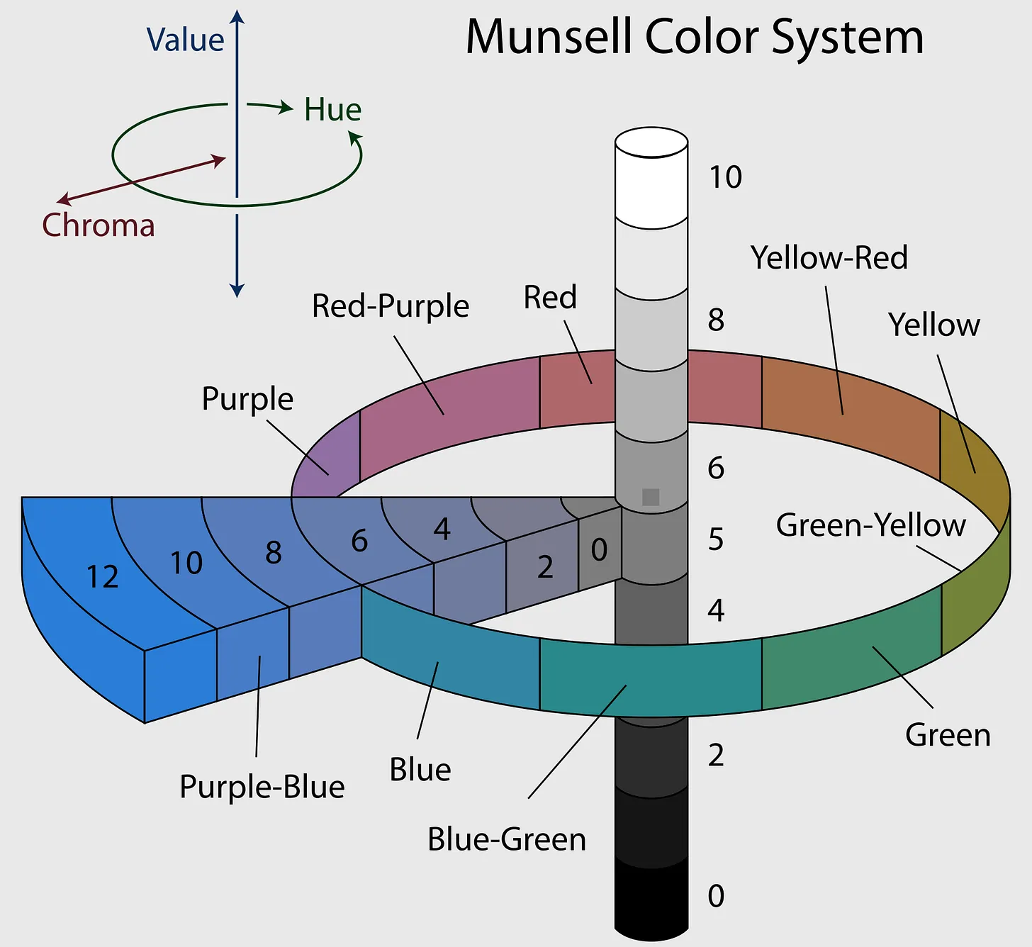
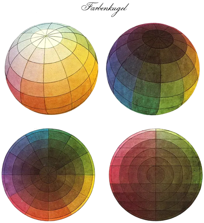
The above chart, with its clear separation of the constituent axes of colour, is the best demonstration of colour as a composite phenomenon, but the fact that Munsell’s system is a geometry means that it’s also possible to represent colour relationships with so-called colour solids — spheres, cones or cubes, whose surfaces are the boundaries of what humans can perceive. In this, Munsell was anticipated by the 1810 Farbenkugel (colour sphere) of the German artist Philipp Otto Runge:
To make a psychologically accurate colour solid, one would need to construct an asymmetrical, pimply ball that would only approximate a sphere, as human eyes don’t respond to light linearly across the visible spectrum. For example, when comparing a yellow and blue with equal physical saturation and lightness (as measured by their spectral profiles), people will judge the yellow to be perceptually lighter.
Issues of colour perception are a particular obsession in the philosophy of consciousness, in my estimate to a distracting and unhelpful degree, but the field has entertained me lately with questions about whether there’s any necessity in the structure of the colour space. Imagine an organism which has only luminosity detection (no colour awareness), for example: we would imagine this as grayscale vision, with white and black as its two poles, but could biology in principle create a redscale (or greenscale and so on) phenomenology? Would red as an opposite to black be somehow less biologically adaptive because it’s less contrastive? What is contrast, scientifically?
I suspect these are not sensible questions: I only think of white and red in the way I do because I already have both of them with their own mutual contrast. Given only a luminosity dimension, perhaps black and white do not have a property of contrast which they hold to some degree, they just are contrast. In that case, no, nature could not create redscale, but equally, ‘white’ is not really the right word for maximum brightness in a true grayscale.
It is worth remembering that in all colour systems and philosophical discussions, colour words are used with a double meaning: ‘red’ is both the colour of specific objects with determinate shades (this apple, this rose, this beetle) and also the hue that can take on many shades, which is an abstraction we’ve never seen (it’s what the apple, the rose and the beetle have in common, if indeed there is such a thing besides our propensity to describe them as ‘red’).
Likewise, there are arguably colours which are not expressible in the Munsell colour system because they cannot be represented without further dimensions like transparency and reflectiveness. There is no HCV or RGB profile that will give you a fully satisfying gold, brass or porcelain (I note that, as well as being colour terms, these are all materials, which is no coincidence, but I don’t believe this undermines their status as true colours — ‘gold’ is a colour word because gold is not simply yellow-brown). So it remains unclear to me whether we’ve even settled what colour is, for us to be able to talk about how it arises within experience.
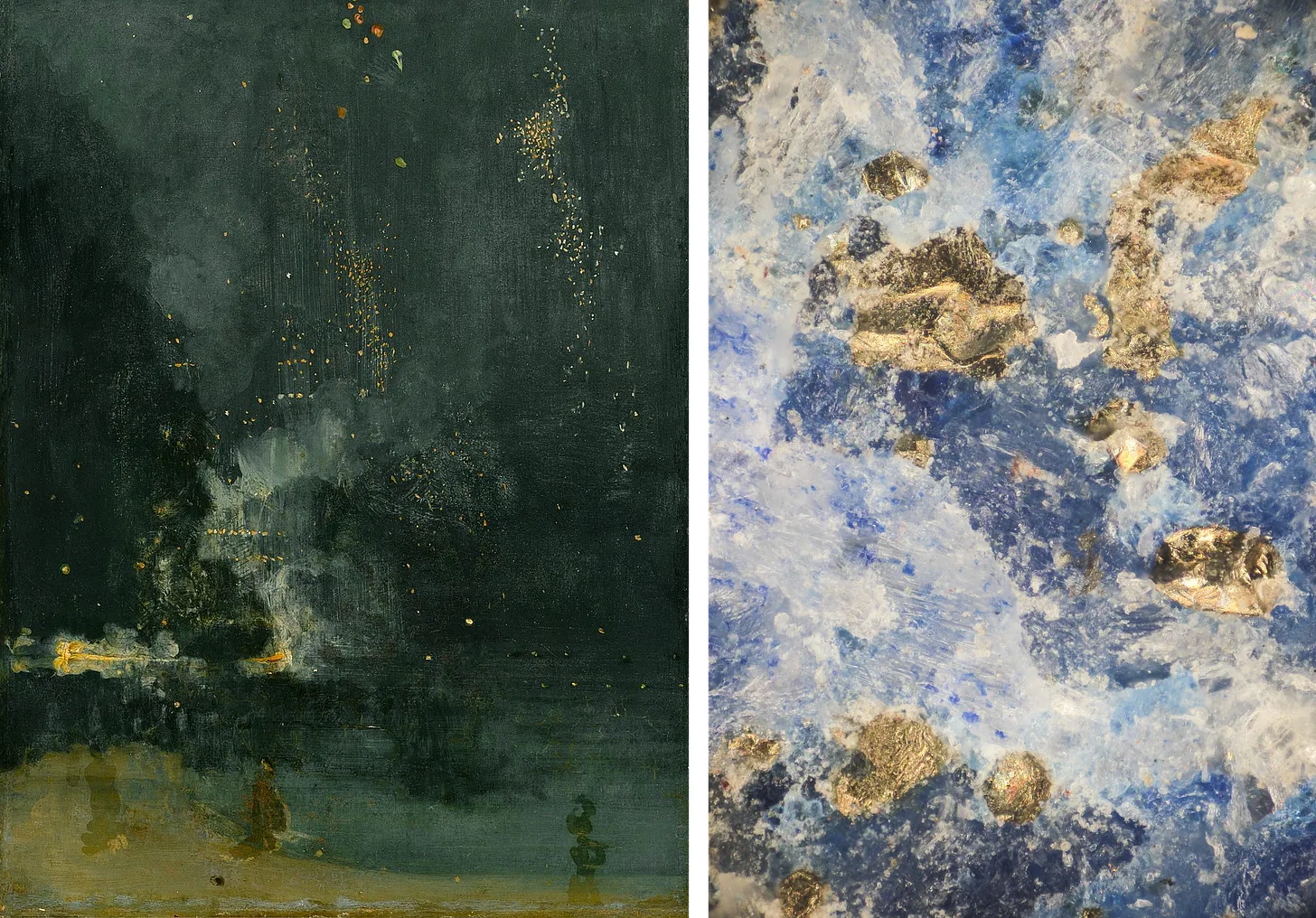
Right: Lapis lazuli under a microscope (240x magnification)
A palette of colour terms
amber, from ambergris, for the sperm whale secretion; the resin used to be called elektron by the Greeks (rubbing it can create static charge)
auburn, surprisingly from Latin albus, ‘white’, shifting over time through various off-whites, possibly also influenced by proximity to Middle English brun, ‘brown’
azure, ultimately from Persian lāžward, which refers to lapis lazuli
carmine, from Latin carminium, ultimately perhaps Sanskrit krmi, ‘insect’, since the colour used to be collected from insect bodies (see crimson)
cerulean, from Latin caeruleus, also denoting the colour, likely related to caelum, ‘sky’
chartreuse, named after the colour of a liqueur made by a Carthusian monastery in the Chartreuse mountains of France
coral, from Latin corallium, for the stony substance secreted by marine polyps used in jewellery and ornaments
crimson, from Old Italian carmesi, ultimately perhaps Sanskrit krmi, ‘insect’, since the colour used to be collected from insect bodies (see carmine)
fuchsia, Latinsation of the surname of botanist Leonhard Fuchs (1501-1566)
magenta, the dye was discovered in 1859 and was named in commemoration of the Battle of Magenta the same year
mauve, from Latin malva, ‘mallow’, by resemblance to the mallow flower
ochre, from Greek khros, ‘pale yellow’, of unknown origin
umber, either from Latin umbra, ‘shadow’, or the Italian region Umbria
vermilion, from Latin vermiculus, ‘little worm’, since the colour used to be collected from the cochineal insect
viridian, from Latin viridis, ‘green, fresh, lively’
Postscript
Some time after writing this, I discovered an incredible digitisation of yet another colour system, Werner’s Nomenclature of Colours, which was first published in 1814 and was used by Charles Darwin on the HMS Beagle. Though more successful by that association, the work was fundamentally the same in conception as Ridgway’s, though its effect is more moving and the digitisation even moreso.